
CSS for the Cookie banner & Preferences
If you are running the Plus or the Enterprise plans of the app, you can apply custom CSS to different elements of the Cookie banner and the Preferences popup.
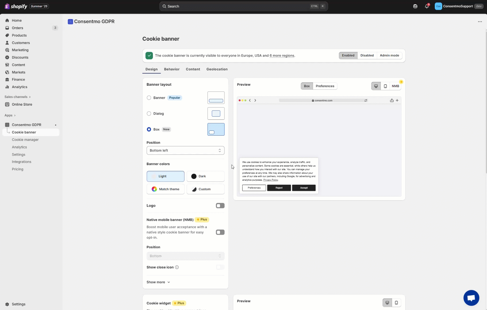
You can navigate to the Cookie banner tab > Design section, as shown below:
Here is a list of the CSS selectors:
Cookie Bar selectors:
The selectors for the Default, Classic and Modern layouts are all the same:

- 1. Main Text:
.isense-cc-message - 2. Privacy Policy text:
.isense-cc-link - 3. Preferences button:
.isense-cc-settings - 4. Reject button:
.isense-cc-deny - 5. Accept button:
.isense-cc-allow - 6. “X” icon:
.isense-close-icon
Preferences Popup selectors:

Table with the **selectors **for all of the above elements, for the different layouts:
- In the below file you will find the table with all the selectors for the Preferences popup elements:
- The colors of the checkboxes/switchers and the ticks can be configured from Consent banner tab > Design section > Checkbox Color & Checkbox Tick Color. Alternatively for the Classic and Modern layouts Design tab > Switcher Inactive and Switcher Active: How to change the color of the switchers in the Preferences popup?
Global parameters
If you would like to apply a global setting for all of the text in the Cookie bar or Preferences popup, for example change the font-size or the font, you can apply it with the following selectors:
Cookie bar:
.isense-cc-window.cc-banner
Preferences popup:
.isense-cc-settings-dialog
Example:
.isense-cc-window.cc-banner { font-family: "Times New Roman", Times, serif; }
Need help?
If you need any help, don’t hesitate to contact our support team at: support@consentmo.com or from the Chat button at the bottom right corner of your browser.
Updated on: 31/07/2025
Thank you!