
CSS for the Cookie banner & Preferences
If you are running the **Plus **or the Enterprise plans of the app, you can apply custom CSS to different elements of the Cookie banner and the Preferences popup.
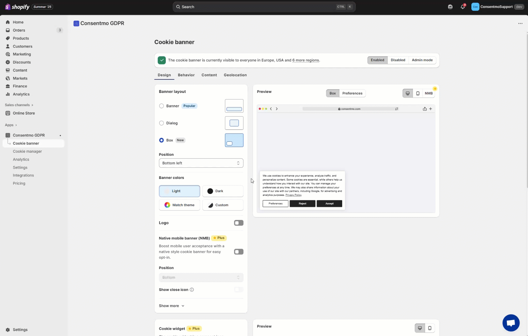
You can navigate to the Cookie banner tab > Design section, as shown below:
Here is a list of the CSS selectors:
Cookie Bar selectors:
The selectors for the Default, Classic and Modern layouts are all the same:

- 1. Main Text:
.isense-cc-message - 2. Privacy Policy text:
.isense-cc-link - 3. Preferences button:
.isense-cc-settings - 4. Reject button:
.isense-cc-deny - 5. Accept button:
.isense-cc-allow - 6. “X” icon:
.isense-close-icon
Preferences Popup selectors:

Table with the **selectors **for all of the above elements, for the different layouts:
- In the below file you will find the table with all the selectors for the Preferences popup elements:
- The colors of the checkboxes/switchers and the ticks can be configured from Consent banner tab > Design section > Checkbox Color & Checkbox Tick Color. Alternatively for the Classic and Modern layouts Design tab > Switcher Inactive and Switcher Active: How to change the color of the switchers in the Preferences popup?
Global parameters
If you would like to apply a global setting for all of the text in the Cookie bar or Preferences popup, for example change the font-size or the font, you can apply it with the following selectors:
Cookie bar:
.isense-cc-window.cc-banner
Preferences popup:
.isense-cc-settings-dialog
Example:
.isense-cc-window.cc-banner { font-family: "Times New Roman", Times, serif; }
Need help?
If you need any help, don’t hesitate to contact our support team at: support@consentmo.com or from the Chat button at the bottom right corner of your browser.
Updated on: 31/07/2025
Thank you!